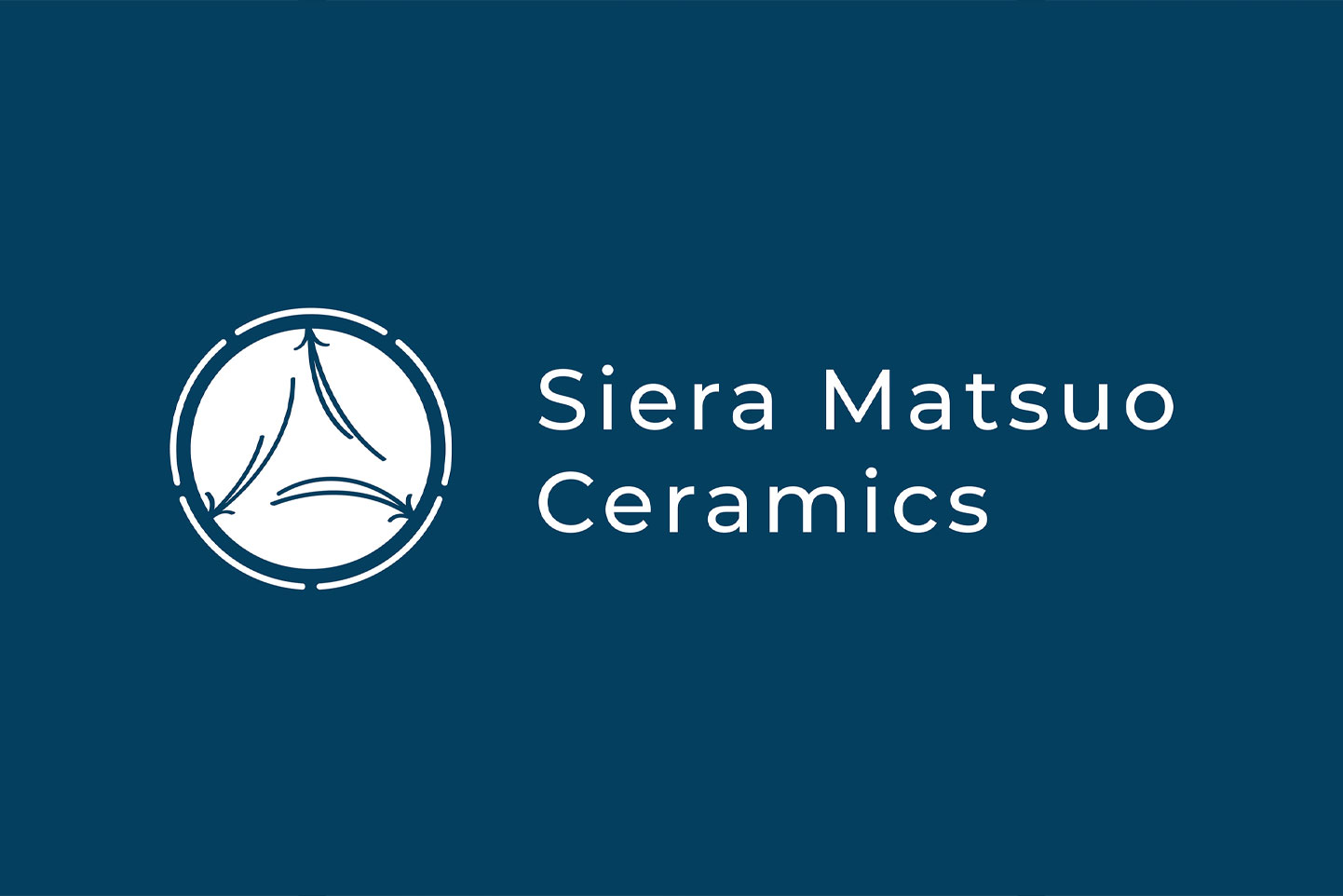
Siera Matsuo Ceramics
Client | Siera Matsuo
Project Type | Art direction, brand development, logo design, photography, print
Specifications | 2″ x 3.5″ business cards, 4″ x 6″ note cards
Brand development including logomark, brand identity, and brand assets for Seattle-based Ceramicist, Siera Matsuo Ceramics. Inspired by the Kamon, or family crest, the logo references Siera Matsuo’s family and Japanese heritage and culture. The choice of blue as the main color hints to aizome, the traditional Japanese indigo dyeing method. The three pine needles in the center is a depiction of Siera’s deep connection to her and her siblings and reflects her last name meaning pine ridge, while the five lines that make up the outer circle represents each of Siera’s family members.
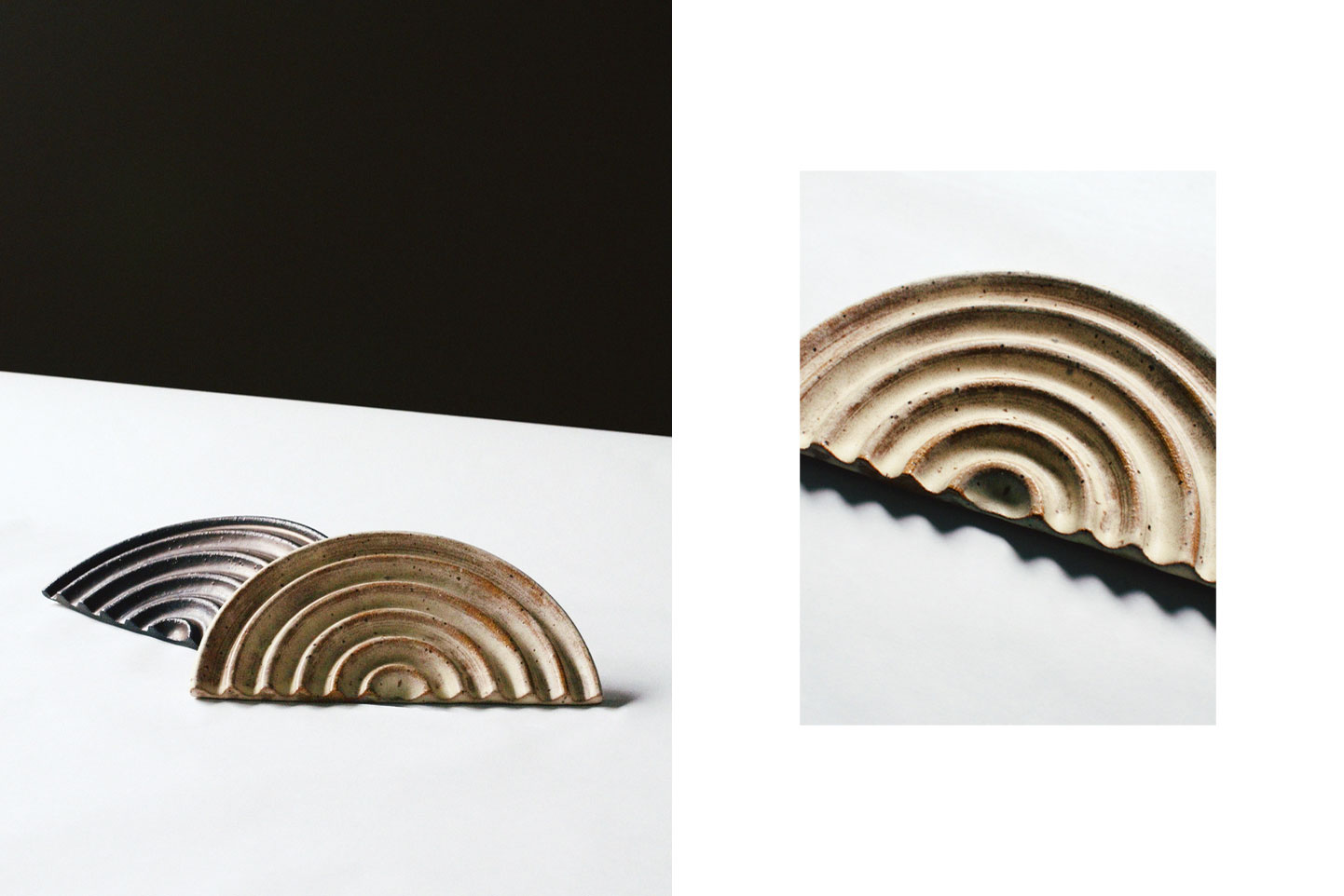
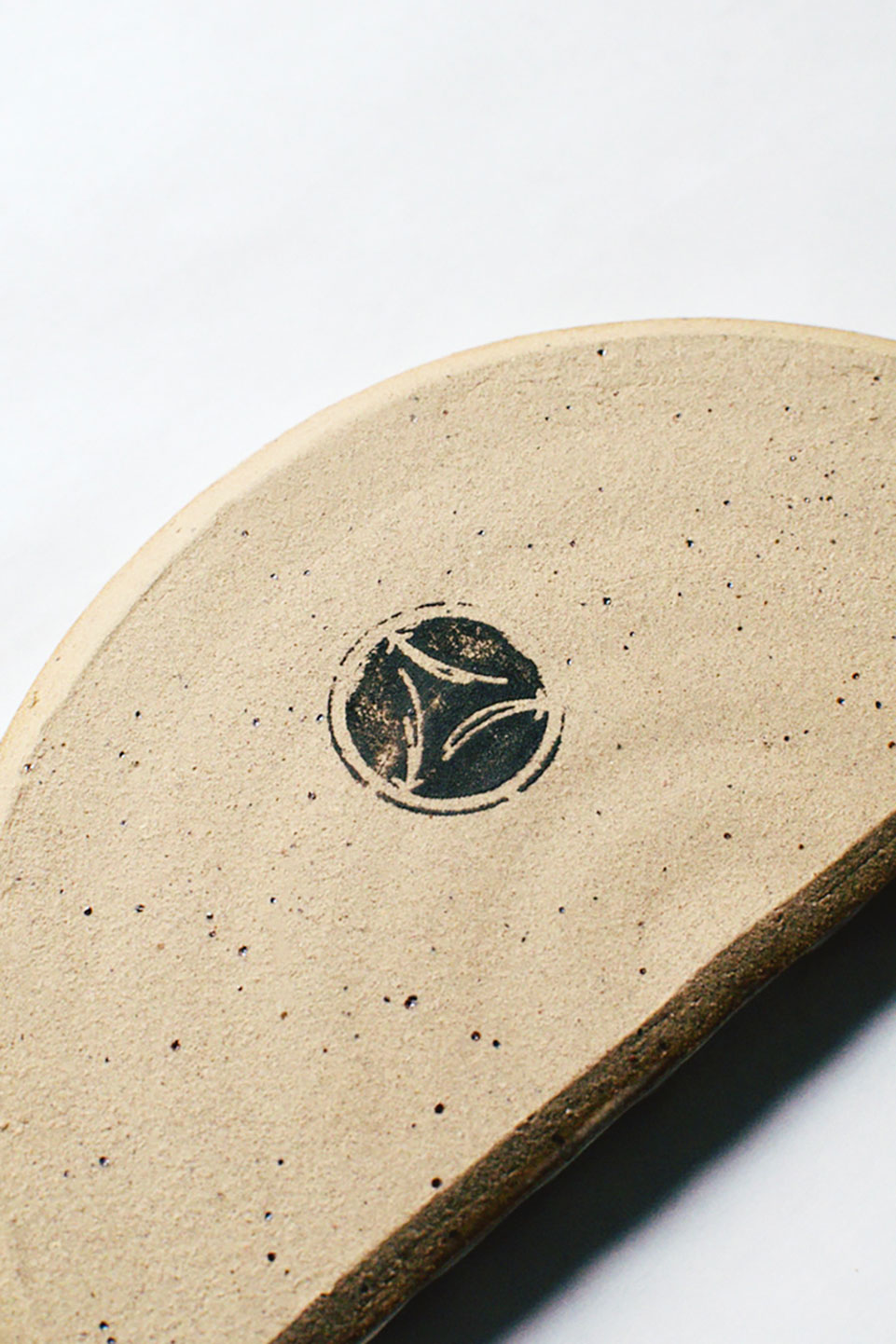
The minimal imagery is driven by Siera Matsuo’s attraction to making handmade, functional wares that revolve around the rituals of daily life, showcasing the details and nuance of each piece.